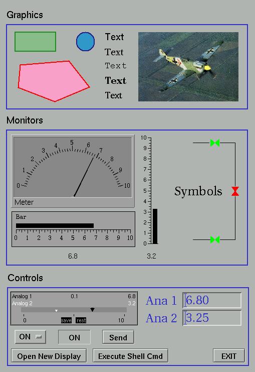
Figure 1
edm core component examples
Introduction
With the introduction of tools like EPICS and VSystem, the task of building complex distributed control systems has been greatly simplified. Furthermore, extending both the content and functionality of these systems is a trivial task. This is generally not the case for applications that have been built on top of these core components and in most cases this is acceptable. There is one class of applications, namely interactive graphical display tools, where the lack of user extensibility is a severe liability. This deficiency arrests the growth of the suite of common display elements and prevents the development and customization of site specific elements for special requirements. Just as EPICS record and device support is easily extended without in-depth knowledge of the core software, so also should the elements of a display tool be extensible, again without in-depth knowledge of either the core behavior of the display tool or the more esoteric details of window-based graphical user interface systems.
Edm is an attempt to fulfill this objective.
Figure 1 is a screenshot showing most of the display elements provided by the core object library.
Program Execution
Synopsis
|
|
edm [ option option ... ] [ filename filename ... ] |
Options
|
|
-x |
execute file on open |
|
|
-nodeit |
disallow edit mode |
|
|
-m "<sym1>=<val1>,<sym2>=<val2>,..." |
build macro substitution list |
|
|
-ctl <string process variable name> |
writing a file name to this pv instructs edm to open and execute the display file |
|
|
-h, -?, -help |
displays help information |
|
|
-v, -version |
displays current version information |
Figure
1
edm core component examples
Environment Variables
|
|
EDMFILES |
Location of fonts.list and colors.list, overrides /etc. |
|
|
EDMOBJECTS |
Location of edmObjects, the edm component object file, overrides /etc. |
|
|
EDMDATAFILES |
Location of display files and display scheme files, overrides ./. The variable takes two values as given below: |
|
|
|
<project directory>:<user directory> |
|
|
Bash example: |
|
|
|
export EDMDATAFILES=/usr/project/screens:/home/me/myscreens |
When
a display is opened in execute mode, the user directory is searched
first.
Program Operation
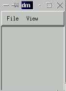
When edm executes, the small main window shown in figure 2 is created.
Figure
2
File Menu functions
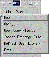
Figure 3
Figure 3 illustrates the File menu items. Each is described below.
|
|
New |
Create a new display file |
|
|
Open |
Open a display file, default directory is the project file directory |
|
|
Open User File |
Open a display file, default directory is the user file directory |
|
|
Import Exchange File |
Read and convert a display information exchange file |
|
|
Refresh User Library |
Experimental use |
|
|
Exit |
Exit edm |
The behavior of each menu item is self evident.
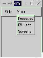
View Menu Functions
Figure
4
Figure 4 illustrates the View menu items. Each is described below.
|
|
Messages |
Open information message window |
|
|
PV List |
Open pv list dialog box |
|
|
Screens |
Open information message window and show names of display files that are currently open; total number of open files is also displayed |
The behavior of each menu item is self evident with the exception of the PV List item.
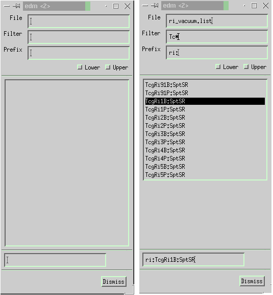
When PV List is chosen, the dialog box shown in figure 5 opens:
Figure
5 & Figure 6
If a file name containing a list of pv names is entered in the File field and the enter key pressed, the list box will be filled with the contents of the file. At any time, a filter value may be entered (currently one of <string>*, *<string>, or <string>). When the enter key is pressed the list will be so qualified. In addition, a prefix string may be entered in the corresponding box and the enter key pressed. Later, when display elements are being created and the user selects a pv from the pv list box, a string consisting of the prefix concatenated with the selected pv will become the current selection and will appear in the text box at the bottom of the pv list dialog box. A fully populated example of this is shown in figure 6. This string may then be pasted into any other dialog box with the middle mouse button.
Creating New Displays
To create a new display, select new from the main window file menu. This creates a new, empty display window. The window may be sized as desired and various display attributes may be set by clicking the middle button in the new display window and selecting Display Properties from the popup menu. This opens a dialog box with which various display attributes may be set. There is one group of attributes that require special consideration. The following fields comprise the current display scheme:
|
|
Display Fg |
Display window foreground color |
|
|
Display Bg |
Display window background color |
|
|
Text Fg |
Default text color |
|
|
1st Control Fg |
Default graphics foreground color #1 |
|
|
2nd Control Fg |
Default graphics foreground color #2 |
|
|
1st Control Bg |
Default graphics background color #1 |
|
|
2nd Control Bg |
Default graphics background color #2 |
|
|
Top Shadow |
Default top shadow color |
|
|
Bottom Shadow |
Default bottom shadow color |
|
|
Default Text Font |
Default font for text objects |
|
|
Default Button Font |
Default font for button objects |
|
|
Default Control Font |
Default font for text objects inside other display objects |
When edm starts, the file default.scheme in the current project directory defines the display scheme for all new displays. Alternatively, display schemes may be interactively loaded by name. The display scheme attributes are used as color and font defaults in the creation of the various control element objects. When a new project is initiated, edm may be used to create a new display scheme by opening a new window, setting the color and font display properties, and saving the scheme as default.scheme in the project file directory. A display scheme is saved by clicking the middle button in the display window and selecting Save Display Scheme from the popup menu.
After the display attributes have been properly set, display element objects may be created as desired and the display file saved by clicking the middle button in the display window and selecting Save As from the popup menu. This opens a dialog box in which the file name may be entered. Note that it is not necessary to enter the file extension (.edl).
Note that the display title may contain symbols that will be expanded in execute mode (see the section entitled Editing Object Properties for more information on symbol expansion).
Comments in Edm Display Files
Comment lines and blank lines may be inserted into the front of edm data files. These lines will be read in and wrtten out again when the file is edited. Therefore, edm data files may contain RCS markers and other comment information.
Edit Mode Operations
Creating Display Objects
Display objects are created by dragging a rectangle with the left mouse button and releasing the button. In most cases, the size of the rectangle will correspond to the initial size of the display object being created. After the button is released, a popup menu will be displayed from which an object category may be selected. Selecting a category opens an additional menu from which the display object may be selected. When an object name is chosen, a property dialog box opens in which the display object properties are specified. This dialog box contains the standard OK, Apply, and Cancel buttons. The functions provided by these buttons may also be invoked by double-clicking the left, center, or right mouse button. The left button corresponds to OK, the center to Apply, and the right to Cancel. This is especially useful during an edit operation, where perhaps only one attribute is being changed. The double-click operation can be used to minimize mouse motion.
Display object properties will be discussed for each individual object in a later section.
Selecting Objects
Objects may be selected as follows:
|
|
Left click selects one object |
|
|
Left clicking on a selected object performs an edit operation. |
|
|
Left clicking on the display background deselects all objects. |
|
|
Shift-left click adds an unselected object to the set of selected objects or removes a selected object from the set of selected objects. |
|
|
Middle dragging a box from top-left to bottom-right adds an object to the set of selected objects if the box encloses the entire extent of the object. |
|
|
Middle dragging a box from bottom-right to top-left adds an object to the set of selected objects if the box encloses at least one corner of the object. |
|
|
Control-left click Is used to cycle through a number of objects of similar size that lie on top of each other. One and only one object must be selected for this to have any effect. |
|
|
Objects may be deselected by left clicking on the display background or by clicking the middle button in the display window and selecting Deselect from the popup menu. |
Moving and Resizing Objects
When objects are selected, eight control points appear on the boundary of the object. Objects are moved by placing the mouse cursor inside the boundary of an object, clicking the left mouse button, and dragging the object to a new location. Objects are resized by placing the mouse cursor over one of the eight control points and left-click dragging the control point to a new location. Once the motion has begun, an arrow key may be pressed to disengage the mouse and engage an arrow keypress pixel-by-pixel motion instead. As before, the operation completes when the mouse button is released. If several objects are selected, they will be moved or resized together. Alternatively, the display object position and size may be specified in the object property dialog box during a create or edit operation.
It is difficult to move very small objects because the control points overlap one another. As a result, a move operation may be forced by control-clicking the left button anywhere on an object and dragging the object to a new location.
If the display window property Snap to Grid has been turned on, the position and size of an object will be constrained accordingly.
Editing Object Properties
Left-clicking on a selected object opens the object property dialog box. If more that one object is selected, pressing the OK button (or double-clicking the left mouse button) will complete the edit of the current object and open the property box for the next one. This continues until each object has been edited or the cancel button is pressed. Editing a group of objects (that have been explicitly grouped) proceeds in a similar manner. Each individual object is edited in succession until all edits have completed or until the cancel button is pressed.
Symbol Substitution
When edm is started, a list of symbol=value pairs may be entered from the command line. These symbols may be referenced in the specification of certain object properties by embedding the form
|
|
$(symbol) |
with a string. A simple example will illustrate this.
Suppose edm was started as
|
|
edm -m "1=one" |
This associates the value one with symbol 1. Now if an object property is specified as
|
|
$(1)_two_three |
then, in execute mode, the property value would be expanded to one_two_three. Multiplexor objects can also affect the value of symbols in execute mode.
Edit Mode Display Window Menu Operations
The following menus may be opened by clicking the middle button on the display window background. Three menus are available and depend on the number of objects currently selected.
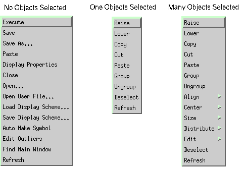
Most operations function in a self evident manner. Operations which require additional information are discussed below.
Operation Explanation
Edit Outlier Searches for objects that have become positioned off the visible portion of the display and, if any are found, opens the property dialog box for the first one found.
|
|
Center |
Centers a group of objects relative to the center position of a reference object. The operation works as follows: if no objects are selected and then all objects are selected at once, the leftmost or topmost object is taken as the reference for horizontal or vertical centering operations respectively; if, one the other hand, one object is selected and then the remaining objects are selected, the first selected object is taken as the reference object. |
|
|
Size |
Sizes a group of objects relative to the size of a reference object. The operation works as follows: if no objects are selected and then all objects are selected at once, the topmost object is taken as the reference for all resizing operations; if, one the other hand, one object is selected and then the remaining objects are selected, the first selected object is taken as the reference object. |
|
|
Edit |
Edits either the display attributes (fonts & colors) or the PV names for a selected group of objects. |
Execute Mode Operations
Execute Mode Display Window Menu Operations
The following menu may be opened by clicking the middle button on the display window background.
Most operations function in a self evident manner. Operations which require additional information are discussed below.
Operation Explanation
|
|
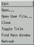
Toggle Title |
Toggles the title contents between the display title string and the display file name. This is useful when edm is executing with the noedit option and the display file name needs to be discovered. |
Drag and Drop Operations
It is often useful to be able to drag-and-drop a PV name from a display object into another application (e.g. StripTool). Core components which contain PVs support this operation via the middle mouse button. Several components contain multiple PVs and it is therefore necessary to select the drag-and-drop source is these cases. This is accomplished by shift-clicking the middle button over the object and selecting the source PV from a menu of choices.
Control Object Stacking
Objects that have not been implemented as motif widgets may be stacked on top of each other to produce multiple actions per pointer click, i.e. clicking on a point lying within the boundaries of N objects will affect all N objects. The following core objects may be used in this manner:
|
|
Button |
|
|
Message Button |
|
|
Related Display |
|
|
Shell Command |
Core Display Objects
Objects
will be listed by category. Categories include Graphics, Monitors,
and Controls. Note that several control objects may also be used as
monitors.
Graphics
Circle
Attributes and behavior are self evident.
Alarm PV and Visibility PV may contain symbols.
Arc
Attributes and behavior are self evident.
Alarm PV and Visibility PV may contain symbols.
Dynamic Symbol
Dynamic symbols exist primarily to build symbol catalogs with a minimum amount of screen real estate. They may also be used to achieve simple animation. For more information on building symbols, see the section entitled Symbol below. A description of some attributes follows.
Attribute Description
|
|
DynSymbol File |
Symbol file name. This is nothing more than a normal edm display file that has been created according to certain specified rules. These will be described in the section entitled Symbol below. |
|
|
Use Gate |
If this box is checked, The Gate Up PV and Gate Down PV fields should contain valid names. When the Gate Up PV contains a value equal to the Gate Up Value, the symbol will cycle upward through its states at a rate give by Rate (in seconds). The Gate Down properties work in a similar manner, causing the symbol to cycle downward through its states. |
|
|
Continuous |
Checking this box makes the symbol cycle upward through its states at a rate given by Rate (in seconds). |
|
|
Initial |
Sets the initial display state of the symbol |
Note that state zero is never displayed, not even if the Initial field is set to 0.
Other attributes are self evident.
Gate Up PV and Gate Down PV may contain symbols.
GIF Image
Attributes and behavior are self evident.
Lines
Attributes and behavior are self evident, but lines are created and edited unlike most other objects. The procedure for creating lines begins like any other object, i.e. a box is drawn with the left mouse button and a property box opens. After the OK button is pressed, however, the behavior changes. At this point, the mouse becomes dedicated to creating and editing line segments. Button action versus function is listed below.
|
|
Action |
Operation |
|
|
Left Click |
Create a line end point |
|
|
Shift-Middle-Click |
Delete most recently created end point |
|
|
Middle-Drag |
Move a line end point; the mouse cursor must be touching the end point to be moved at the initiation of the drag operation |
|
|
Shift-Left-Click |
Exit line create mode |
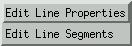
When the left mouse button is clicked on a selected line object, the menu shown in the figure below is displayed:
The user may then choose to edit line properties via the dialog box or line segments via the line segment create/edit mouse operations.
Alarm PV and Visibility PV may contain symbols.
Rectangle
Rectangle attributes and behavior are self evident with the exception of the invisible flag. This flag is only used in conjuction with symbols and will be discussed in a following section.
Alarm PV and Visibility PV may contain symbols.
Static Text
Attributes and behavior are self evident.
Alarm
PV, Visibility PV, and
Value may contain symbols.
Monitors
Bar
The bar object maps the value of a pv to a bar length.When the initial box is drawn to create a bar object, the aspect ration of the box determines the orientation of the created bar object.
|
|
Attribute |
Description |
|
|
Readback PV |
Primary pv; if Null PV is blank, bar length represents the value of this pv |
|
|
Null PV |
If non-blank, then the bar length represents the difference between the value of the Readback PV and the value of this pv |
|
|
Label |
Literal value used when Label Type is Literal |
|
|
Scale Format |
f maps precision to the number of decimal places |
|
|
|
g maps precision to the number of significant digits |
|
|
|
e maps precision to the number of decimal places but value always includes exponent |
Other attributes are self evident.
Readback PV and Null PV may contain symbols.
Message Box
The message box objects provides a simple scrollable message log window that may be associated with a log file. Values written to the string pv Readback PV are logged to the window and optionally logged to the associated file. The value may end with "\n" which causes the message log window to advance to a newline and puts a newline into the log file. When the log file fills up (as determined by Max File Size) it is renamed to <name>_2. Any existing file of this name is deleted.
All attributes are self evident.
Readback PV may contain symbols.
Symbol
The symbol object maps the value of a pv or a group of pvs into 1 of N images contained in another edm display file.
|
|
Attribute |
Description |
|
|
Symbol File |
Symbol file name. This is nothing more than a normal edm display file that has been created according to certain specified rules. |
|
|
Binary Truth Table |
If checked, all pv names listed are mapped into a single bit of the final value that determines the image to be displayed. The first pv in the list corresponds to bit 0, the second to bit 1, and so on. Each pv is considered to have a value of 0 if the actual numerical value is also 0. Otherwise, the value is considered to be 1. This value, 0 or 1, is then mapped into the associated bit position and all bits are considered to determine the final numerical value. |
|
|
|
If not checked, only the first pv in the list is used in determining the displayed image. |
|
|
Number of Items |
Total number of images in the symbol. This must be less than or equal to the actual number of images in the symbol file. |
|
|
Item Number |
This field is special in that in selects one element of a group of array fields labeled <= and <. |
|
|
>= and < |
These fields are used to determine a value match against the value of one or a group of pvs. The first match determines the image that will be displayed. |
Note that image (and item) number 1 is reserved for the out-of-band condition and the value range should reflect this fact. If not, image 1 will be displayed for the specified range of values and also for the case in which the value of the pv matches none of the specified ranges.
Note also, in edit mode, image number 2 is displayed.
All other attributes are self evident.
All PV Names may contain symbols.
Creating a Symbol File
A legal symbol file is one which contains N non-nested groups of objects. The image number corresponds to the stacking level of the grouped object, i.e. The lowest object is image 1 and the highest object is image N. So a symbol file may be created by the following steps.
Draw components of all images (no groups allowed)
Group all components of each image once and only once
Order the groups by using the raise and lower operations to make image 1 the lowest and image N the highest
Save the display file
This is, at best, a tedious procedure. As a result, a method of automating this process is included. This procedure is outlined below and relies on the use of the invisible rectangle. Here are the steps.
Draw a rectangle and make it invisible
Draw all static portions of the symbol inside the invisible rectangle
Copy and paste these image components N times
For each resulting image, draw the dynamic components
When all images are complete, make sure all groups have been ungrouped, arrange all images by columns and rows, click the middle button on the display background and choose Auto Make Symbol. Edm will display the status of this operation in the message box. When arranging the images, note that column 1, row 1 is image 1; column 2, row 1 is image 2; and so on from left-top to right-bottom.
Save the display file
Controls
Text
The text control displays the value of a pv as text. This control is commonly used as a monitor.
|
|
Attribute |
Description |
|
|
Fg Color |
Notice the text field to the right of this attribute. The name of a pv may be entered here. If so, the integer value of the pv is mapped to the corresponding color in the edm color pallatte. This color is then used for the text foreground color in execute mode. |
|
|
Use Display Bg |
Ignore Bg Color attribute, use display background color instead. |
|
|
Display Format |
Natural - depends on pv type, self evident except for floating point pvs where precision is mapped to number of significant digits. |
|
|
|
Float - Precision is mapped to number of decimal places. |
|
|
|
Exponential - Precision is mapped to number of decimal places and exponent is included in display. |
|
|
|
All other format values are self evident. |
|
|
Null PV Name |
If non-blank, the value of this pv is compared to the value of the pv given by PV Name. If these values are equal, the Null Color is used for the text foreground color in execute mode. We use this feature to indicate that the current value of a pv is the same as the corresponding saved value. |
|
|
Smart Refresh |
This box must be checked if the text will be on top of a graphics object. |
All other attributes are self evident.
The pv
associated with Fg Color, PV Name, and Null PV Name may
contain symbols.
Slider
The slider object controls the value of a numeric pv and may optionally monitory the value of another numeric readback pv.
|
|
Attribute |
Description |
|
|
Display Format |
f maps precision to the number of decimal places |
|
|
|
g maps precision to the number of significant digits |
|
|
|
e maps precision to the number of decimal places but value always includes exponent |
Other
attributes are self evident.
Control PV, Control Label PV, Readback PV, Readback label PV and Saved Value PV may contain symbols.
The figure below shows an example of a slider in execute mode.
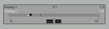
The
black arrow is the control lever, the white arrow is the
readback indicator, the vertical mark to the right of the control
lever is the current saved value, and the value 0.1 in the
upper-middle is the current increment value. Dragging the control
lever changes the control value continuously. Clicking to the left of
the control lever decrements the value by the amount given by the
current increment (clicking and holding invokes an auto-repeat
decrement). Clicking to the right of the control lever increments the
value by the amount given by the current increment (clicking and
holding invokes an auto-repeat increment). Clicking on the save
box saves the current value of the control pv and clicking on the
restore box restores the saved value.
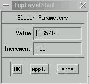
Finally, clicking above the control lever opens a dialog box like the one show below. The control value and the current increment may be changed here.
Button
The button object is used to control or monitor a two state enumerated type pv. Optionally, a readback pv may also be specified.
If Control PV and Readback PV are both non-blank and their values are not equal, then the button background color is given by the Inconsistent color button.
All other attributes are self evident.
Control PV and Readback PV may contain symbols.
Menu Button
The menu button object is used to control or monitor any enumerated type pv. This object employs a motif widget and does not align with other objects well.
All attributes are self evident.
Control PV and Readback PV may contain symbols.
Message Button
The message button object can send a value to any type pv. A value is sent on press, on release, or in both cases. If Button Type is Toggle, then the Press Value is sent on the toggle-on action and the Release Value is sent on the toggle-off action. A null entry for either Press Value or Release Value implies that no value should be sent for the respective operation.
Destination is the name of the pv to which the value is sent.
All other attributes are self evident.
Destination may contain symbols.
Exit Button
The exit button object is used to close an active display. Optionally it may only iconize the display. It may also be employed to exit edm.
Menu Mux
The menu mux object is a multiplexor object which can dynamically change the value of up to four symbols and then deactivate/reactive a display. In this manner, connections to pvs from various controls may be dynamically changed by selecting a new multiplexor state.
|
|
Attribute |
Description |
|
|
PV Name |
An optional numeric control pv which works in conjunction with the multiplexor. The integer value of this pv is changed when the user changes the multiplexor menu. Conversely, changing the value of the pv will also change the multiplexor state. Note that a value of 0 corresponds to the first menu entry. |
|
|
Number of Items |
Sets the number of multiplexor menu items and the number of values for the set of symbols |
|
|
Item Number |
This field is special in that in selects one element of a group of array fields labeled Tag, Symbol, Value, ... |
|
|
Tag |
The string displayed in the menu for this set of symbol,value pairs |
|
|
Symbol |
Symbol string that gets expanded to Value |
|
|
Value |
Expansion value corresponding to previous Symbol string |
|
|
Initital State |
Initial multiplexor state (starting at 0); effective only if PV Name is null |
PV Name and Initital State may contain symbols, but these symbols are not affected by the multiplexor.
Related Display
The related display object is used to open another display in execute mode. The values of up to four pvs may optionally be set.
|
|
Attribute |
Description |
|
|
Display File Name |
Name of display file to open. Explicit directory paths are honored; if no directory is specified, the user directory is searched before the project directory. |
|
|
On Focus |
Opens the display file without window decorations when the pointer moves inside the button rather than on a button click. When the pointer moves outside the button to some other region on the parent window not occupied by a Motif widget, the display file closes. Note that the Close Current Display option has no effect when this option is selected. |
|
|
Set Display Position |
Opens new display file near related display button |
|
|
Duplicates Allowed |
Allows multiple instances of the display to be opened at the same time. A display file is uniquely identified by its name and by its list of symbols,value pairs, so a duplicate is one which has the same name as another and also contains the same list of symbols and values. |
|
|
Cascade |
Opens additional instances of a display in a cascading manner. This does not currently work with all window managers. |
|
|
Macros |
New list of symbol,value pairs as sym1=val1,sym2=val2,... that will be passed to the new display depending on the value of Mode and Propagate |
|
|
|
The special strings <WINID>, <TITLE>, <PROJDIR>, and <USERDIR> may be used as symbol values and will be translated to the window id, the display title, the project display directory, and the user display directory. |
|
|
|
Mode & Propagate Mode=Append,Propagate not checked - append specified list of macros to the list at the time edm was executed and pass the result to the new display. |
|
|
|
Mode=Replace,Propagate not checked - pass only the specified list of macros to the new display. |
|
|
|
Mode=Append,Propagate checked - append specified list of macros to the list in the current display file. |
|
|
|
Mode=Replace,Propagate checked - pass only the specified list of macros to the new display (same as above). |
Other attributes are self evident.
All PV fields may contain symbols.
Shell Command
The shell command object is used to invoke a system shell command by pressing a button.
|
|
Attribute |
Description |
|
|
Allow Multiple Instances |
Allow another shell command to be invoked before a previous one has completed |
|
|
Auto Exec Interval |
Execute shell command periodically at this rate (seconds) |
Other attributes are self evident.
Shell Command may contain symbols.
The special strings <WINID>, <TITLE>, <PROJDIR>, and <USERDIR> may be supplied in the command argument list and will be translated to the window id, the display title, the project display directory, and the user display directory. We use these to print displays and to export displays to GIF format for dynamic web publishing.
Administrator's Guide
Site Font and Color Files
Presently, fonts and colors are specified in two files, fonts.list and colors.list respectively. The default location is /etc but may be overridden with the environment variable EDMFILES.
Colors
The color file structure is shown below, where r, g, and b are integers ranging from 0 to 65535:
|
|
<Major version number> <Minor version number> <Release number> |
|
|
<Number of non-blinking colors> <Number of blinking colors> <Number of color palette columns> |
|
|
<r> <g> <b> |
|
|
<r> <g> <b> |
|
|
<r> <g> <b> |
and so on for the total number of non-blinking colors
|
|
<r> <g> <b> (blink color 1 on) |
|
|
<r> <g> <b> (blink color 1 off) |
|
|
<r> <g> <b> (blink color 2 on) |
|
|
<r> <g> <b> (blink color 2 off) |
and so on for the total number of blinking colors
|
|
<r> <g> <b> (disconnected color) |
|
|
<r> <g> <b> (invalid color) |
|
|
<r> <g> <b> (major alarm color) |
|
|
<r> <g> <b> (minor alarm color) |
|
|
<r> <g> <b> (no alarm color) |
The specification for the no alarm state may either be a valid r, g, b combination or may be -1 -1 -1. In the former case, for object colors which are alarm sensitive, the specified r, g, b values determine the non-alarm color. In the later case, the object takes on the user specified color when no alarms are present.
Fonts
The font file structure contains three lines of header information and a list of X font specifications such that for a given font family and set of sizes, each family-size pair contains a normal regular font, a normal italic font, a bold regular font, and a bold italic font. Furthermore, the font weight must be "bold" or "medium" and the slant must be "o" or "i".
The header information follows:
|
|
<Major version number> <Minor version number> <Release number> |
|
|
Default display element font tag given as family-weight-slant-pointsize (e.g. helvetica-medium-r-10.0) |
|
|
Default text font tag given as family-weight-slant-pointsize (e.g. helvetica-medium-r-18.0) |
These default fonts are used if all other attempts to resolve a given font specification fail. This can occur, for example, if a display file is copied from one site to another where the two sites have been configured with different sets of available fonts.
Bitmap fonts are specified as shown in the followings example for the courier family:
|
|
-adobe-courier-bold-o-normal--10-100-75-75-m-60-iso8859-1 |
|
|
-adobe-courier-bold-o-normal--12-120-75-75-m-70-iso8859-1 |
|
|
-adobe-courier-bold-o-normal--14-140-75-75-m-90-iso8859-1 |
|
|
-adobe-courier-bold-r-normal--10-100-75-75-m-60-iso8859-1 |
|
|
-adobe-courier-bold-r-normal--12-120-75-75-m-70-iso8859-1 |
|
|
-adobe-courier-bold-r-normal--14-140-75-75-m-90-iso8859-1 |
|
|
-adobe-courier-medium-o-normal--10-100-75-75-m-60-iso8859-1 |
|
|
-adobe-courier-medium-o-normal--12-120-75-75-m-70-iso8859-1 |
|
|
-adobe-courier-medium-o-normal--14-140-75-75-m-90-iso8859-1 |
|
|
-adobe-courier-medium-r-normal--10-100-75-75-m-60-iso8859-1 |
|
|
-adobe-courier-medium-r-normal--12-120-75-75-m-70-iso8859-1 |
|
|
-adobe-courier-medium-r-normal--14-140-75-75-m-90-iso8859-1 |
Note that only 10, 12, and 14 point fonts have been specified. All available fonts will normally be included in the list.
Scalable fonts are specified as shown in the followings example for the utopia family:
|
|
-adobe-utopia-bold-i-normal--*-90-75-75-p-*-iso8859-1 |
|
|
-adobe-utopia-bold-i-normal--*-100-75-75-p-*-iso8859-1 |
|
|
-adobe-utopia-bold-i-normal--*-110-75-75-p-*-iso8859-1 |
|
|
-adobe-utopia-bold-i-normal--*-2880-75-75-p-*-iso8859-1 |
|
|
-adobe-utopia-bold-r-normal--*-90-75-75-p-*-iso8859-1 |
|
|
-adobe-utopia-bold-r-normal--*-100-75-75-p-*-iso8859-1 |
|
|
-adobe-utopia-bold-r-normal--*-110-75-75-p-*-iso8859-1 |
|
|
-adobe-utopia-bold-r-normal--*-2880-75-75-p-*-iso8859-1 |
|
|
-adobe-utopia-medium-i-normal--*-90-75-75-p-*-iso8859-1 |
|
|
-adobe-utopia-medium-i-normal--*-100-75-75-p-*-iso8859-1 |
|
|
-adobe-utopia-medium-i-normal--*-110-75-75-p-*-iso8859-1 |
|
|
-adobe-utopia-medium-i-normal--*-2880-75-75-p-*-iso8859-1 |
|
|
-adobe-utopia-medium-r-normal--*-90-75-75-p-*-iso8859-1 |
|
|
-adobe-utopia-medium-r-normal--*-100-75-75-p-*-iso8859-1 |
|
|
-adobe-utopia-medium-r-normal--*-110-75-75-p-*-iso8859-1 |
|
|
-adobe-utopia-medium-r-normal--*-2880-75-75-p-*-iso8859-1 |
Again,
note that only a few fonts sizes have been specified.
Site Component Object Files
Display Objects
Display
element components are specified in the file edmObjects. This file is
included in the distribution and is updated only when additional
components are installed. The default location is /etc but may be
overridden with the environment variable EDMOBJECTS. The file
contains a single line header and one line of information per
component as shown below.
|
|
<Number of components> |
|
|
<component 1 id> <sharable library file> <type> <name> |
|
|
<component 2 id> <sharable library file> <type> <name> |
and so on, until all components have been enumerated
The
component id must be unique and may be a uuid.
Each sharable
library file may contain multiple components.
The values for
type are Graphics,
Monitors, and
Controls.
Name
is the name seen by the user in the object creation menu and should
be unique but may be changed by the user in the case of namespace
collision.
Independently developed components intended to be
shared among members of a larger community should include object ids
and library file names which are derived from uuids.
In
general, the edm object file need not be manually manipulated. If the
component developer has done things correctly, new components are
added to the system as follows:
|
|
edm -add <edm component library file with full directory path> |
For example, the command:
|
|
edm -add /usr/edm/components/newstuff.so |
will
add all components in newstuff.o to the edm object file. Note that to
add new components, you must have read and write permission to the
edm object file.
Library file components may be listed with
the command:
|
|
edm -show <edm component library file with full directory path> |
Therefore, to examine the components in the library file from the previous example, the command becomes:
|
|
edm -show /usr/edm/components/newstuff.so |
PV Objects
PV components are used only by the
generic PV version of edm. The EPICS specific version does not make
use of PV components but the PV component file must be installed
nevertheless.
PV components are specified in the file
edmPvObjects. This file is included in the distribution and is
updated only when additional components are installed. The default
location is /etc but may be overridden with the environment variable
EDMPVOBJECTS. The file contains a single line header and one line of
information per component as shown below.
|
|
<Number of components> |
|
|
<component 1 id> <sharable library file> <PV name> |
|
|
<component 2 id> <sharable library file> <PV name> |
and
so on, until all components have been enumerated.
There are
currently no edm commands to manage these components.
Utility Library and Include Files
Edm requires the following library and include files which provides various services, including a number of platform dependent functions.
Library:
|
|
lib114135a4-6f6c-11d3-95bc-00104b8742df.so |
Include Files:
|
|
avl.h |
|
|
crc.h |
|
|
sys_types.h |
|
|
thread.h |